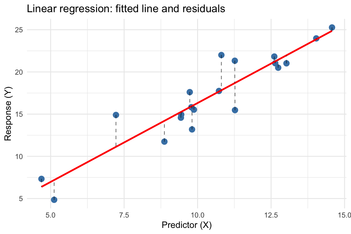
Week 9: Regression

What is regression about?

  • Modeling the relationship between variables
  • Response variable (dependent variable, outcome): what we want to predict or explain
  • Predictor variable(s) (independent variable(s), explanatory variable(s)): what we use to predict or explain
  • Potential goals:
    • Prediction: estimate the response for new observations
    • Inference: understand whether and how predictors affect the response

The regression framework

Simple linear regression

  • Models the relationship between:
    • One numeric response variable (\(Y\))
    • One numeric predictor variable (\(X\))
  • The model equation: \[Y = \beta_0 + \beta_1 X + \varepsilon \]

Components of the model

Symbol Name Description
\(Y\) Response The variable we want to predict
\(X\) Predictor The variable we use to predict
\(\beta_0\) Intercept Expected value of \(Y\) when \(X = 0\)
\(\beta_1\) Slope Change in \(Y\) for one-unit increase in \(X\)
\(\varepsilon\) Error term Random variation not explained by \(X\)

Interpreting the slope

  • \(\beta_1\) represents the rate of change
  • For every one-unit increase in \(X\), we expect \(Y\) to change by \(\beta_1\) units
  • Examples:
    • If \(X\) = years of education and \(Y\) = salary, then \(\beta_1\) = expected change in salary per additional year of education
    • If \(X\) = temperature and \(Y\) = ice cream sales, then \(\beta_1\) = expected change in sales per degree increase

The least squares principle

  • We don’t know the true values of \(\beta_0\) and \(\beta_1\)
  • We estimate them from data using least squares:
    • Choose \(\hat{\beta}_0\) and \(\hat{\beta}_1\) to minimize the sum of squared residuals
    • Residual = observed value - predicted value = \(y_i - (\hat{\beta}_0 + \hat{\beta}_1 x_i)\)
  • The fitted (predicted) values: \(\hat{y}_i = \hat{\beta}_0 + \hat{\beta}_1 x_i\)

Visual representation

Illustrating the regression line and residuals
set.seed(42)
x <- rnorm(20, mean = 10, sd = 2)
y <- 2 + 1.5 * x + rnorm(20, mean = 0, sd = 2)
df <- data.frame(x = x, y = y)
fit <- lm(y ~ x, data = df)

ggplot(df, aes(x = x, y = y)) +
  geom_point(size = 3, color = "steelblue") +
  geom_smooth(method = "lm", se = FALSE, color = "red", linewidth = 1) +
  geom_segment(aes(xend = x, yend = fitted(fit)), 
               linetype = "dashed", alpha = 0.5) +
  labs(title = "Linear regression: fitted line and residuals",
       x = "Predictor (X)", y = "Response (Y)") +
  theme_minimal()

Fitting regression models in R

The lm() function

  • lm stands for “linear model”
  • Basic syntax:
model <- lm(response ~ predictor, data = dataset)
  • Formula notation: response ~ predictor
    • ~ means “is modeled as a function of”
    • Left side: response variable
    • Right side: predictor variable(s)

Example: Cars dataset

  • Built-in dataset on cars from the 1920s
  • Variables:
    • speed: speed of car (mph)
    • dist: stopping distance (ft)
View the cars dataset
data(cars)
head(cars)
  speed dist
1     4    2
2     4   10
3     7    4
4     7   22
5     8   16
6     9   10
View the cars dataset
str(cars)
'data.frame':   50 obs. of  2 variables:
 $ speed: num  4 4 7 7 8 9 10 10 10 11 ...
 $ dist : num  2 10 4 22 16 10 18 26 34 17 ...

Visualizing the relationship

Scatterplot of speed vs. stopping distance
ggplot(cars, aes(x = speed, y = dist)) +
  geom_point(size = 3, color = "steelblue") +
  labs(title = "Car speed vs. stopping distance",
       x = "Speed (mph)", y = "Stopping distance (ft)") +
  theme_minimal()

Research question

  • How does stopping distance depend on speed?
  • We will model stopping distance as a function of speed: \[\text{dist} = \beta_0 + \beta_1 \times \text{speed} + \epsilon\]

Fitting the model

cars_model <- lm(dist ~ speed, data = cars)
summary(cars_model)

Call:
lm(formula = dist ~ speed, data = cars)

Residuals:
    Min      1Q  Median      3Q     Max 
-29.069  -9.525  -2.272   9.215  43.201 

Coefficients:
            Estimate Std. Error t value Pr(>|t|)    
(Intercept) -17.5791     6.7584  -2.601   0.0123 *  
speed         3.9324     0.4155   9.464 1.49e-12 ***
---
Signif. codes:  0 '***' 0.001 '**' 0.01 '*' 0.05 '.' 0.1 ' ' 1

Residual standard error: 15.38 on 48 degrees of freedom
Multiple R-squared:  0.6511,    Adjusted R-squared:  0.6438 
F-statistic: 89.57 on 1 and 48 DF,  p-value: 1.49e-12

Breaking down the output

summary(cars_model)

Call:
lm(formula = dist ~ speed, data = cars)

Residuals:
    Min      1Q  Median      3Q     Max 
-29.069  -9.525  -2.272   9.215  43.201 

Coefficients:
            Estimate Std. Error t value Pr(>|t|)    
(Intercept) -17.5791     6.7584  -2.601   0.0123 *  
speed         3.9324     0.4155   9.464 1.49e-12 ***
---
Signif. codes:  0 '***' 0.001 '**' 0.01 '*' 0.05 '.' 0.1 ' ' 1

Residual standard error: 15.38 on 48 degrees of freedom
Multiple R-squared:  0.6511,    Adjusted R-squared:  0.6438 
F-statistic: 89.57 on 1 and 48 DF,  p-value: 1.49e-12

Key components:

  • Coefficients table: estimates of \(\beta_0\) and \(\beta_1\), with standard errors, t-statistics, and p-values
  • Residual standard error: estimate of \(\sigma\) (standard deviation of errors)
  • R-squared: proportion of variance explained by the model (0 to 1)
  • F-statistic: overall test of whether the model is useful

Interpreting the coefficients

coef(cars_model)
(Intercept)       speed 
 -17.579095    3.932409 
  • Intercept (\(\hat{\beta}_0 = -17.58\)): estimated stopping distance when speed = 0 mph
    • May not be meaningful if predictor values near 0 are not observed
  • Slope (\(\hat{\beta}_1 = 3.93\)): for each 1 mph increase in speed, stopping distance increases by about 3.93 feet on average

Hypothesis test for the slope

  • Testing whether there is a linear relationship:
    • \(H_0: \beta_1 = 0\) (mean of stopping distance does not depend on speed)
    • \(H_A: \beta_1 \neq 0\) (mean of stopping distance does depend on speed)
summary(cars_model)$coefficients
              Estimate Std. Error   t value     Pr(>|t|)
(Intercept) -17.579095  6.7584402 -2.601058 1.231882e-02
speed         3.932409  0.4155128  9.463990 1.489836e-12
  • The p-value for speed is very small (< 0.001)
  • We reject \(H_0\): strong evidence of a linear relationship

Confidence intervals for coefficients

confint(cars_model, level = 0.95)
                 2.5 %    97.5 %
(Intercept) -31.167850 -3.990340
speed         3.096964  4.767853
  • We are 95% confident that the true slope is between 3.1 and 4.77
  • For each 1 mph increase in speed, the stopping distance increases by approximately 3.1 to 4.77 feet

Adding the regression line to the plot

Scatterplot with fitted regression line
ggplot(cars, aes(x = speed, y = dist)) +
  geom_point(size = 3, color = "steelblue") +
  geom_smooth(method = "lm", se = TRUE, color = "red") +
  labs(title = "Car speed vs. stopping distance",
       subtitle = "With fitted regression line and 95% confidence band",
       x = "Speed (mph)", y = "Stopping distance (ft)") +
  theme_minimal()

Making predictions

  • Once we have a fitted model, we can predict the response for new predictor values
# Predict stopping distance for a car going 22 mph
new_data <- data.frame(speed = 22)
predict(cars_model, newdata = new_data)
      1 
68.9339 
  • Expected stopping distance for a car traveling at 22 mph is about 68.9 feet

Confidence interval for the mean response

# Get prediction with confidence interval
predict(cars_model, newdata = new_data, interval = "confidence")
      fit     lwr      upr
1 68.9339 61.8963 75.97149
  • This is a confidence interval for the mean response at speed = 22 mph
  • We are 95% confident that the average stopping distance for cars at 22 mph is between 61.9 and 76 feet

Prediction intervals for a new observation

# Get prediction interval for individual observation
predict(cars_model, newdata = new_data, interval = "prediction")
      fit      lwr      upr
1 68.9339 37.22044 100.6474
  • This is a prediction interval for a single new observation
  • We are 95% confident that a single car traveling at 22 mph will have a stopping distance between 37.2 and 100.6 feet
  • Prediction intervals are wider than confidence intervals. How much wider?

Model diagnostics

Checking model assumptions

Linear regression assumes:

  1. Linearity: relationship between \(X\) and \(Y\) is linear
  2. Independence: observations are independent
  3. Normality: residuals are normally distributed
  4. Equal variance (homoscedasticity): variance of residuals is constant across predictor values

We can check these using diagnostic plots

Residual plots

Standard diagnostic plots for regression
par(mfrow = c(2, 2))
plot(cars_model)

Interpreting diagnostic plots

  1. Residuals vs Fitted:
    • Check for linearity and equal variance
    • Should see random scatter around horizontal line at 0
  2. Normal Q-Q:
    • Check normality of residuals
    • Points should fall close to diagonal line
  3. Scale-Location:
    • Check equal variance assumption
    • Should see horizontal line with random scatter
  4. Residuals vs Leverage:
    • Identify influential observations
    • Points far from the pack may have undue influence

Impact of violated assumptions

When assumptions are violated, several problems can occur:

  1. Biased coefficient estimates (wrong slope/intercept)
  2. Invalid inference (p-values and confidence intervals are wrong)
  3. Poor predictions (unreliable forecasts)
  4. Inefficient estimates (larger standard errors than necessary)

Let’s see examples of each violation…

Violation 1: Non-linearity 👻

Simulate non-linear association
set.seed(123)
x <- seq(-10, 10, length.out = 50)
y <- 2 + 0.1 * x^2 + rnorm(50, sd = 3)
df_nonlinear <- data.frame(x, y)

ggplot(df_nonlinear, aes(x, y)) +
  geom_point() +
  geom_smooth(method = "lm", se = FALSE, 
              color = "red") +
  labs(title = "Linear fit to curved data",
       subtitle = "Red line misses the pattern") +
  theme_minimal()

Consequences:

  • Linear model fails to capture the true relationship
  • Systematic bias in predictions
  • Residuals show clear pattern

Solutions:

  • Depending on the type of non-linearity, some steps that may help:
    • Transform variables (log, square root)
    • Add polynomial terms (x + I(x^2))
    • Use non-linear models

Non-linearity: Diagnostic plot 🎃

model_nonlinear <- lm(y ~ x, data = df_nonlinear)
par(mfrow = c(1, 2))
plot(model_nonlinear, which = 1)  # Residuals vs. Fitted
plot(model_nonlinear, which = 2)  # Q-Q plot

Notice the curved pattern in residuals vs. fitted - this indicates non-linearity!

Violation 2: Non-constant variance (heteroskedasticity) 🕷️

Simulate non-constant variance
set.seed(456)
x <- runif(100, 0, 10)
y <- 2 + 3 * x + rnorm(100, sd = x)  # SD increases with x
df_hetero <- data.frame(x, y)

ggplot(df_hetero, aes(x, y)) +
  geom_point() +
  geom_smooth(method = "lm", se = TRUE, 
              color = "red") +
  labs(title = "Heteroskedasticity",
       subtitle = "Variance increases with x") +
  theme_minimal()

Consequences:

  • Coefficient estimates are still unbiased
  • Standard errors are wrong
  • Confidence intervals and p-values are unreliable
  • Some predictions more uncertain than others

Solutions:

  • Weighted least squares
  • Transform response variable
  • Use robust standard errors

Heteroscedasticity: Diagnostic plot 🕸️

model_hetero <- lm(y ~ x, data = df_hetero)
par(mfrow = c(1, 2))
plot(model_hetero, which = 1)  # Residuals vs. Fitted
plot(model_hetero, which = 3)  # Scale-Location

The “fan shape” in the residual plot reveals non-constant variance.

Violation 3: Non-normal residuals 🧟

Simulate non-normal errors
set.seed(789)
x <- runif(100, 0, 10)
# Add some extreme outliers
y <- 2 + 3 * x + c(rt(95, df = 2) * 2, 
                    rnorm(5, mean = 20, sd = 1))
df_nonnormal <- data.frame(x, y)

ggplot(df_nonnormal, aes(x, y)) +
  geom_point() +
  geom_smooth(method = "lm", se = TRUE, 
              color = "red") +
  labs(title = "Heavy-tailed residuals",
       subtitle = "With outliers") +
  theme_minimal()

Consequences:

  • Coefficients still unbiased (least-squares principal still applies and does not require normality)
  • (Unless the sample size is very large) Hypothesis tests and confidence intervals may lose validity (CIs too narrow or too wide, HTs not maintaining specified significance level)

Solutions:

  • Transform response variable (e.g. Box-Cox transformations)
  • Interpret confidence intervals / hypothesis tests with skepticism

Non-normality: Diagnostic plot 💀

model_nonnormal <- lm(y ~ x, data = df_nonnormal)
par(mfrow = c(1, 2))
plot(model_nonnormal, which = 2)  # Q-Q plot
plot(model_nonnormal, which = 5)  # Residuals vs Leverage

Departures from the diagonal line in Q-Q plot indicate non-normality. Point 99 is influential!

Violation 4: Non-independence 🦇

Simulate correlated errors
set.seed(101)
n <- 100
x <- 1:n
errors <- arima.sim(n = n, 
                    list(ar = 0.7), sd = 2)
y <- 2 + 0.5 * x + errors
df_autocor <- data.frame(x, y)

ggplot(df_autocor, aes(x, y)) +
  geom_point() +
  geom_line(alpha = 0.3) +
  geom_smooth(method = "lm", se = TRUE, 
              color = "red") +
  labs(title = "Autocorrelated errors",
       subtitle = "Time series data") +
  theme_minimal()

Consequences:

  • Common in time series or clustered data
  • Standard errors are severely underestimated
  • P-values too small (false positives)
  • Confidence intervals too narrow

Solutions:

  • Time series models (model the correlation in the error terms)

Key takeaway

  • Always check diagnostic plots before interpreting results
  • Violated assumptions don’t always invalidate the analysis:
    • Some violations are worse than others
    • Large samples can mitigate some problems
    • Transformations can often help
  • When in doubt:
    • Use robust methods
    • Report diagnostics
    • Be transparent about limitations
  • No model is perfect - focus on whether violations are severe enough to affect your conclusions

Multiple regression

Extending to multiple predictors

  • Multiple regression includes more than one predictor \[Y = \beta_0 + \beta_1 X_1 + \beta_2 X_2 + \cdots + \beta_p X_p + \epsilon\]

  • Each coefficient \(\beta_j\) represents the effect of \(X_j\) on \(Y\), holding other predictors constant

  • R syntax:

model <- lm(response ~ predictor1 + predictor2 + predictor3,
            data = dataset)

Example: mtcars dataset

View the mtcars dataset
data(mtcars)
head(mtcars)
                   mpg cyl disp  hp drat    wt  qsec vs am gear carb
Mazda RX4         21.0   6  160 110 3.90 2.620 16.46  0  1    4    4
Mazda RX4 Wag     21.0   6  160 110 3.90 2.875 17.02  0  1    4    4
Datsun 710        22.8   4  108  93 3.85 2.320 18.61  1  1    4    1
Hornet 4 Drive    21.4   6  258 110 3.08 3.215 19.44  1  0    3    1
Hornet Sportabout 18.7   8  360 175 3.15 3.440 17.02  0  0    3    2
Valiant           18.1   6  225 105 2.76 3.460 20.22  1  0    3    1
  • mpg: miles per gallon
  • wt: weight (1000 lbs)
  • hp: horsepower
  • cyl: number of cylinders

Research question

  • How do weight and horsepower jointly affect fuel efficiency (mpg)? \[\text{mpg} = \beta_0 + \beta_1 \times \text{wt} + \beta_2 \times \text{hp} + \epsilon\]

Fitting the multiple regression model

mtcars_model <- lm(mpg ~ wt + hp, data = mtcars)
summary(mtcars_model)

Call:
lm(formula = mpg ~ wt + hp, data = mtcars)

Residuals:
   Min     1Q Median     3Q    Max 
-3.941 -1.600 -0.182  1.050  5.854 

Coefficients:
            Estimate Std. Error t value Pr(>|t|)    
(Intercept) 37.22727    1.59879  23.285  < 2e-16 ***
wt          -3.87783    0.63273  -6.129 1.12e-06 ***
hp          -0.03177    0.00903  -3.519  0.00145 ** 
---
Signif. codes:  0 '***' 0.001 '**' 0.01 '*' 0.05 '.' 0.1 ' ' 1

Residual standard error: 2.593 on 29 degrees of freedom
Multiple R-squared:  0.8268,    Adjusted R-squared:  0.8148 
F-statistic: 69.21 on 2 and 29 DF,  p-value: 9.109e-12

Interpreting multiple regression coefficients

coef(mtcars_model)
(Intercept)          wt          hp 
37.22727012 -3.87783074 -0.03177295 
  • Intercept (\(\hat{\beta}_0 = 37.23\)): expected mpg when weight and horsepower are both 0 (not meaningful)
  • wt (\(\hat{\beta}_1 = -3.88\)): for each 1000 lb increase in weight, mpg decreases by about 3.88, holding horsepower constant
  • hp (\(\hat{\beta}_2 = -0.03\)): for each 1 hp increase, mpg decreases by about 0.03, holding weight constant

Comparing models

  • We can compare models with different numbers of predictors
# Simple model: mpg vs weight only
model1 <- lm(mpg ~ wt, data = mtcars)

# Multiple model: mpg vs weight and horsepower
model2 <- lm(mpg ~ wt + hp, data = mtcars)

# Compare R-squared
summary(model1)$r.squared
[1] 0.7528328
summary(model2)$r.squared
[1] 0.8267855
  • Model 2 explains more variance (higher R-squared)

ANOVA for model comparison

anova(model1, model2)
Analysis of Variance Table

Model 1: mpg ~ wt
Model 2: mpg ~ wt + hp
  Res.Df    RSS Df Sum of Sq      F   Pr(>F)   
1     30 278.32                                
2     29 195.05  1    83.274 12.381 0.001451 **
---
Signif. codes:  0 '***' 0.001 '**' 0.01 '*' 0.05 '.' 0.1 ' ' 1
  • The ANOVA F-test compares the two models
  • Small p-value indicates that adding hp significantly improves the model
  • The more complex model (model2) is preferred

Categorical predictors

Including categorical variables

  • Categorical predictors are automatically converted to dummy variables
  • Example: modeling mpg as a function of number of cylinders
    • cyl can be 4, 6, or 8
mtcars$cyl <- factor(mtcars$cyl)
cyl_model <- lm(mpg ~ cyl, data = mtcars)
summary(cyl_model)

Call:
lm(formula = mpg ~ cyl, data = mtcars)

Residuals:
    Min      1Q  Median      3Q     Max 
-5.2636 -1.8357  0.0286  1.3893  7.2364 

Coefficients:
            Estimate Std. Error t value Pr(>|t|)    
(Intercept)  26.6636     0.9718  27.437  < 2e-16 ***
cyl6         -6.9208     1.5583  -4.441 0.000119 ***
cyl8        -11.5636     1.2986  -8.905 8.57e-10 ***
---
Signif. codes:  0 '***' 0.001 '**' 0.01 '*' 0.05 '.' 0.1 ' ' 1

Residual standard error: 3.223 on 29 degrees of freedom
Multiple R-squared:  0.7325,    Adjusted R-squared:  0.714 
F-statistic:  39.7 on 2 and 29 DF,  p-value: 4.979e-09

Interpreting categorical coefficients

coef(cyl_model)
(Intercept)        cyl6        cyl8 
  26.663636   -6.920779  -11.563636 
  • R creates dummy variables with the first level as the reference category
    • Here, 4 cylinders is the reference
  • Intercept (\(\hat{\beta}_0 = 26.66\)): mean mpg for 4-cylinder cars
  • cyl6 (\(\hat{\beta}_1 = -6.92\)): 6-cylinder cars have about 6.92 lower mpg than 4-cylinder cars, on average
  • cyl8 (\(\hat{\beta}_2 = -11.56\)): 8-cylinder cars have about 11.56 lower mpg than 4-cylinder cars, on average

Visualizing categorical regression

Boxplot with group means
ggplot(mtcars, aes(x = cyl, y = mpg, fill = cyl)) +
  geom_boxplot(alpha = 0.5) +
  stat_summary(fun = mean, geom = "point", shape = 18, size = 4, color = "red") +
  labs(title = "MPG by number of cylinders",
       subtitle = "Red diamonds show group means (regression estimates)",
       x = "Number of cylinders", y = "Miles per gallon") +
  theme_minimal() +
  theme(legend.position = "none")

Key R functions for regression

Summary table

Function Purpose Example
lm() Fit linear model lm(y ~ x, data = df)
summary() Model summary statistics summary(model)
coef() Extract coefficients coef(model)
confint() Confidence intervals confint(model)
predict() Make predictions predict(model, newdata)
plot() Diagnostic plots plot(model)
anova() Compare models anova(model1, model2)

Formula syntax in R

Formula Meaning
y ~ x Simple regression: y on x
y ~ x1 + x2 Multiple regression: y on x1 and x2
y ~ x1 + x2 + x1:x2 Include interaction between x1 and x2
y ~ x1 * x2 Equivalent to y ~ x1 + x2 + x1:x2
y ~ . Use all other variables as predictors
y ~ x - 1 Regression without intercept

Important considerations

Correlation vs. causation

  • Regression reveals associations, not necessarily causation
  • Just because \(X\) predicts \(Y\) doesn’t mean \(X\) causes \(Y\)
  • Possible explanations for correlation:
    1. \(X\) causes \(Y\)
    2. \(Y\) causes \(X\)
    3. A third variable causes both \(X\) and \(Y\) (confounding)
    4. The association is due to chance
  • Randomized experiments (like the clinical trials in Week 4) provide stronger evidence for causation

Extrapolation

  • Extrapolation: making predictions outside the range of observed data
  • The linear relationship may not hold beyond the observed range
  • Example: predicting stopping distance for a car going 100 mph using our cars model
    • The data only include speeds from 4 to 25 mph
    • Extrapolating to 100 mph is risky

Limitations of R-squared

  • R-squared measures the proportion of variance explained
  • Higher R-squared doesn’t always mean a better model:
    • Adding more predictors always increases R-squared
    • A model with lower R-squared might generalize better
    • R-squared doesn’t tell us if the model assumptions are met
  • Use adjusted R-squared when comparing models with different numbers of predictors
    • Penalizes for adding unnecessary predictors

Example: Full analysis

Palmer Penguins dataset

Load and display the penguins dataset
if(!require(palmerpenguins)) install.packages("palmerpenguins")
library(palmerpenguins)
data(penguins)
str(penguins)
tibble [344 × 8] (S3: tbl_df/tbl/data.frame)
 $ species          : Factor w/ 3 levels "Adelie","Chinstrap",..: 1 1 1 1 1 1 1 1 1 1 ...
 $ island           : Factor w/ 3 levels "Biscoe","Dream",..: 3 3 3 3 3 3 3 3 3 3 ...
 $ bill_length_mm   : num [1:344] 39.1 39.5 40.3 NA 36.7 39.3 38.9 39.2 34.1 42 ...
 $ bill_depth_mm    : num [1:344] 18.7 17.4 18 NA 19.3 20.6 17.8 19.6 18.1 20.2 ...
 $ flipper_length_mm: int [1:344] 181 186 195 NA 193 190 181 195 193 190 ...
 $ body_mass_g      : int [1:344] 3750 3800 3250 NA 3450 3650 3625 4675 3475 4250 ...
 $ sex              : Factor w/ 2 levels "female","male": 2 1 1 NA 1 2 1 2 NA NA ...
 $ year             : int [1:344] 2007 2007 2007 2007 2007 2007 2007 2007 2007 2007 ...

Research question

  • How does body mass depend on flipper length and species?
  • Let’s build a multiple regression model

Exploratory visualization

Scatterplot colored by species
ggplot(penguins, aes(x = flipper_length_mm, y = body_mass_g, color = species)) +
  geom_point(size = 2, alpha = 0.6) +
#   geom_smooth(method = "lm", se = FALSE) +
  labs(title = "Body mass vs. flipper length by species",
       x = "Flipper length (mm)", y = "Body mass (g)") +
  theme_minimal()

Fitting the model

# Remove missing values
penguins_clean <- na.omit(penguins[, c("body_mass_g", "flipper_length_mm", "species")])

# Fit model
penguin_model <- lm(body_mass_g ~ flipper_length_mm + species, data = penguins_clean)
summary(penguin_model)

Call:
lm(formula = body_mass_g ~ flipper_length_mm + species, data = penguins_clean)

Residuals:
    Min      1Q  Median      3Q     Max 
-927.70 -254.82  -23.92  241.16 1191.68 

Coefficients:
                   Estimate Std. Error t value Pr(>|t|)    
(Intercept)       -4031.477    584.151  -6.901 2.55e-11 ***
flipper_length_mm    40.705      3.071  13.255  < 2e-16 ***
speciesChinstrap   -206.510     57.731  -3.577 0.000398 ***
speciesGentoo       266.810     95.264   2.801 0.005392 ** 
---
Signif. codes:  0 '***' 0.001 '**' 0.01 '*' 0.05 '.' 0.1 ' ' 1

Residual standard error: 375.5 on 338 degrees of freedom
Multiple R-squared:  0.7826,    Adjusted R-squared:  0.7807 
F-statistic: 405.7 on 3 and 338 DF,  p-value: < 2.2e-16

Interpreting the results

coef(penguin_model)
      (Intercept) flipper_length_mm  speciesChinstrap     speciesGentoo 
       -4031.4769           40.7054         -206.5101          266.8096 
  • Intercept: Expected body mass for Adelie penguin with 0 mm flipper length (not meaningful)
  • flipper_length_mm: For each 1 mm increase in flipper length, body mass increases by about 40.7 g, holding species constant
  • speciesChinstrap: Chinstrap penguins are about 206.5 g lighter than Adelie, holding flipper length constant
  • speciesGentoo: Gentoo penguins are about 266.8 g heavier than Adelie, holding flipper length constant

Model diagnostics

Diagnostic plots
par(mfrow = c(2, 2))
plot(penguin_model)

Making predictions

# Predict body mass for a Gentoo penguin with 210 mm flippers
new_penguin <- data.frame(
  flipper_length_mm = 210,
  species = "Gentoo"
)

predict(penguin_model, newdata = new_penguin, interval = "prediction")
       fit     lwr      upr
1 4783.467 4040.52 5526.413
  • We predict a Gentoo penguin with 210 mm flippers will have a body mass around 4783 g
  • The 95% prediction interval is (4041, 5526) g

The two cultures

Two approaches to statistical modeling

Leo Breiman (2001) identified two cultures in statistical modeling:

Culture 1: Data Modeling

  • Focus on inference
  • Assume a stochastic model (e.g., linear regression)
  • Estimate parameters and test hypotheses
  • Interpretability is key
  • Assumptions matter greatly
  • This lecture has focused here

Culture 2: Algorithmic Modeling

  • Focus on prediction
  • Treat the data mechanism as unknown
  • Prioritize predictive accuracy
  • “Black box” models acceptable
  • Less concern about distributional assumptions
  • The box-office prediction case study has some of this flavor

Implications for your work

  • In prediction tasks:
    • Diagnostic plots are less critical if the model predicts well on new data
    • Large sample sizes can overcome some assumption violations
    • Cross-validation and test set performance matter more than p-values
    • The “true” model may be unknowable and that’s okay
  • In inference tasks (like much of today):
    • Understanding relationships is the goal
    • Assumptions must be checked carefully
    • Coefficient interpretation requires proper model specification
    • Causal claims require even stronger assumptions

Summary

Key takeaways

  1. Regression models relationships between variables
  2. Simple linear regression: one predictor, estimates slope and intercept
  3. Multiple regression: multiple predictors, each coefficient represents effect holding others constant
  4. R function: lm(response ~ predictors, data = dataset)
  5. Use summary(), coef(), confint(), and predict() to interpret results
  6. Check model assumptions using diagnostic plots
  7. Categorical predictors are handled automatically via dummy variables
  8. Remember: correlation ≠ causation

Next steps

  • Continue with Case Study 1
  • Practice fitting and interpreting regression models
  • Think about:
    • What makes a good predictor?
    • How do we choose which variables to include?
    • What should we do if assumptions are violated?