DATA 505: Statistics Using R
Week 5: Data manipulation & visualization
2025-12-09
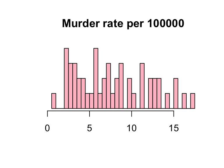
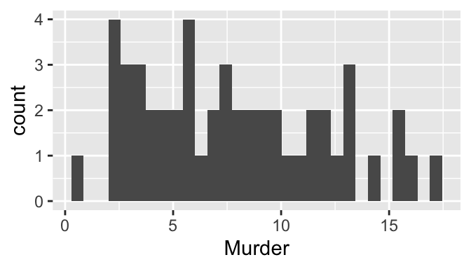
Histogram
- Histogram is a uni-variate graph. To describe a distribution, keep in mind properties of location, spread, and shape.
- Visualization elements can be modified by adding arguments within the function
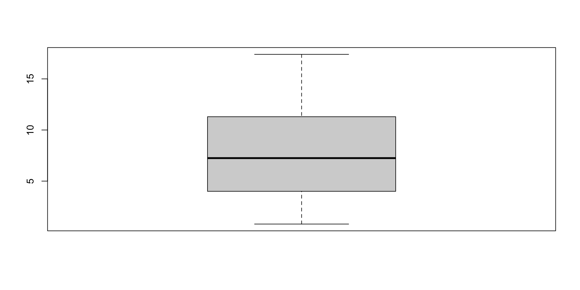
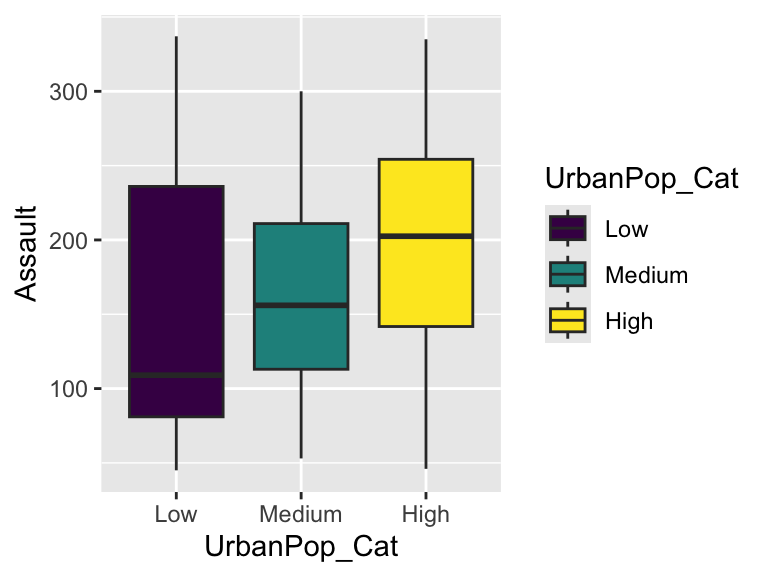
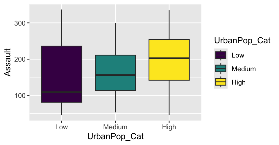
Boxplot
- Boxplot is based on the 5-number summary: min, Q1, Q2 (median), Q3, max
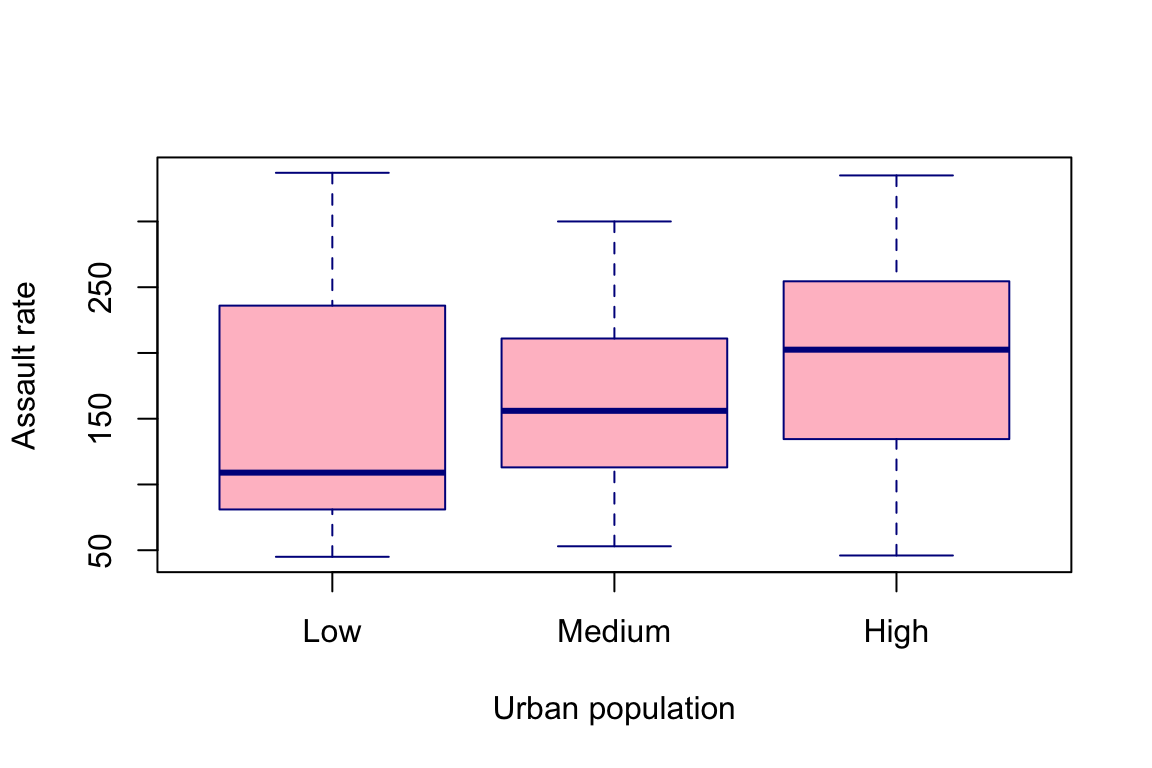
Side-by-side boxplots
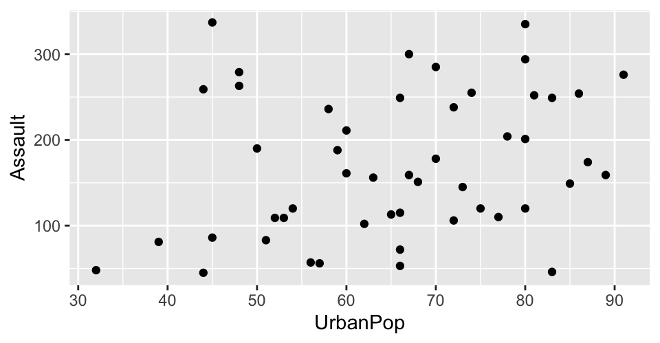
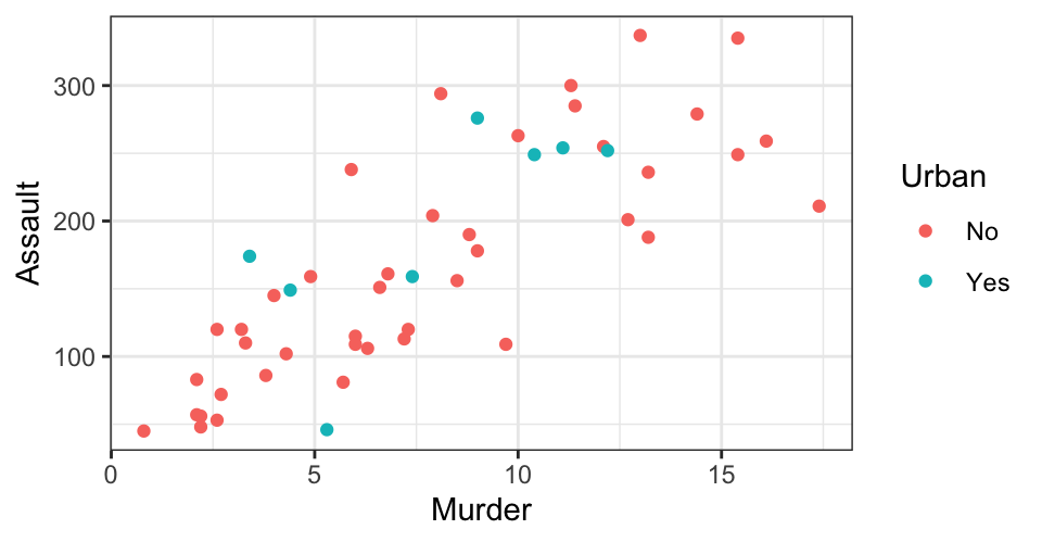
Scatterplot
- Scatterplots are bi-variate; useful to detect relationship between two numeric (scale) variables
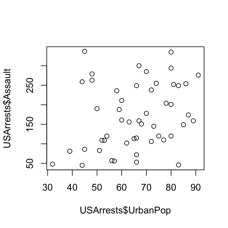
Example 1
- ggplot2 is an alternative, more unified framework (Grammar of Graphics) for creating plots and graphics in R
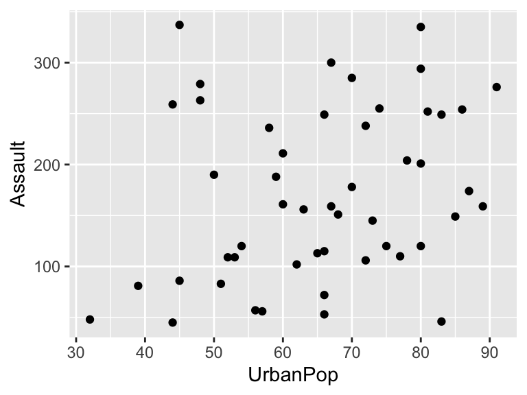
Example 2
Example 1 explained
Example 2 explained
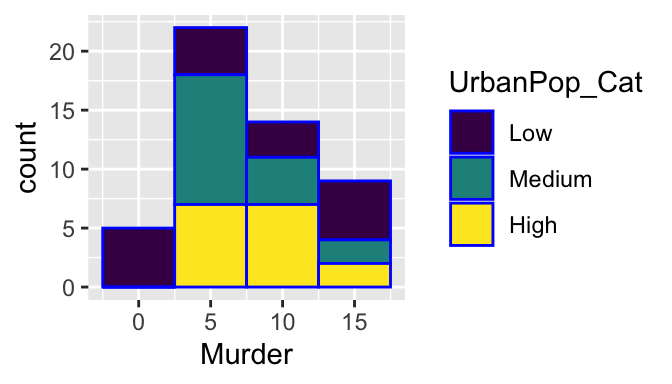
geom_histogram
- Recall: histogram is univariate; y-axis is always frequency, so we don’t need a y=_ mapping
- Add another dimension (i.e., map another variable to another aesthetic)
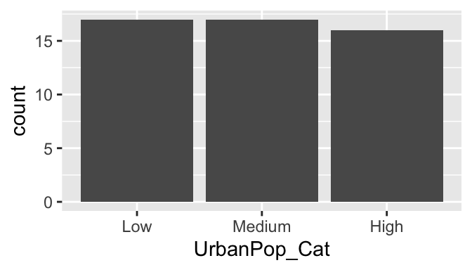
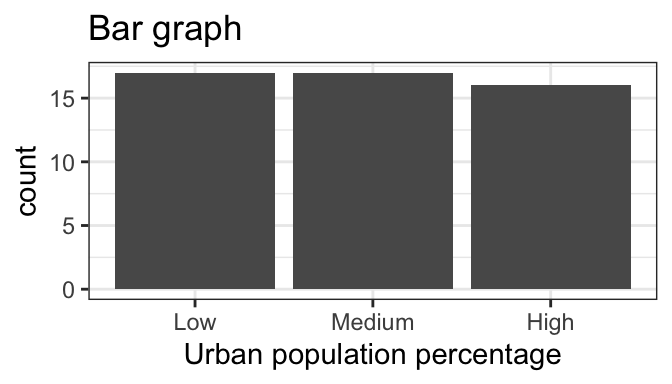
geom_bar
- The bar graph shows that each category has roughly the same number of states, as expected.
geom_text
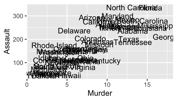
- Try: change geom_text to geom_label
- Try: add geom_point
Customize ggplot with +
ggplot offers a very convenient syntax (+) to add elements and layers
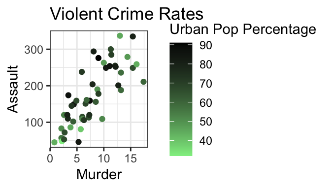
Example: change gradient color
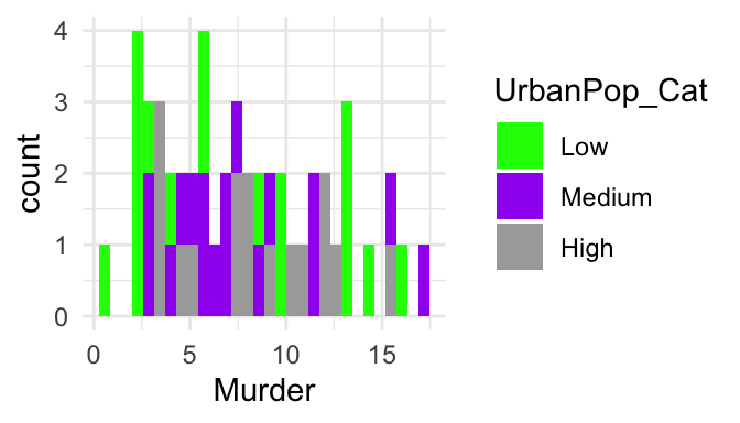
Example: change categorical color
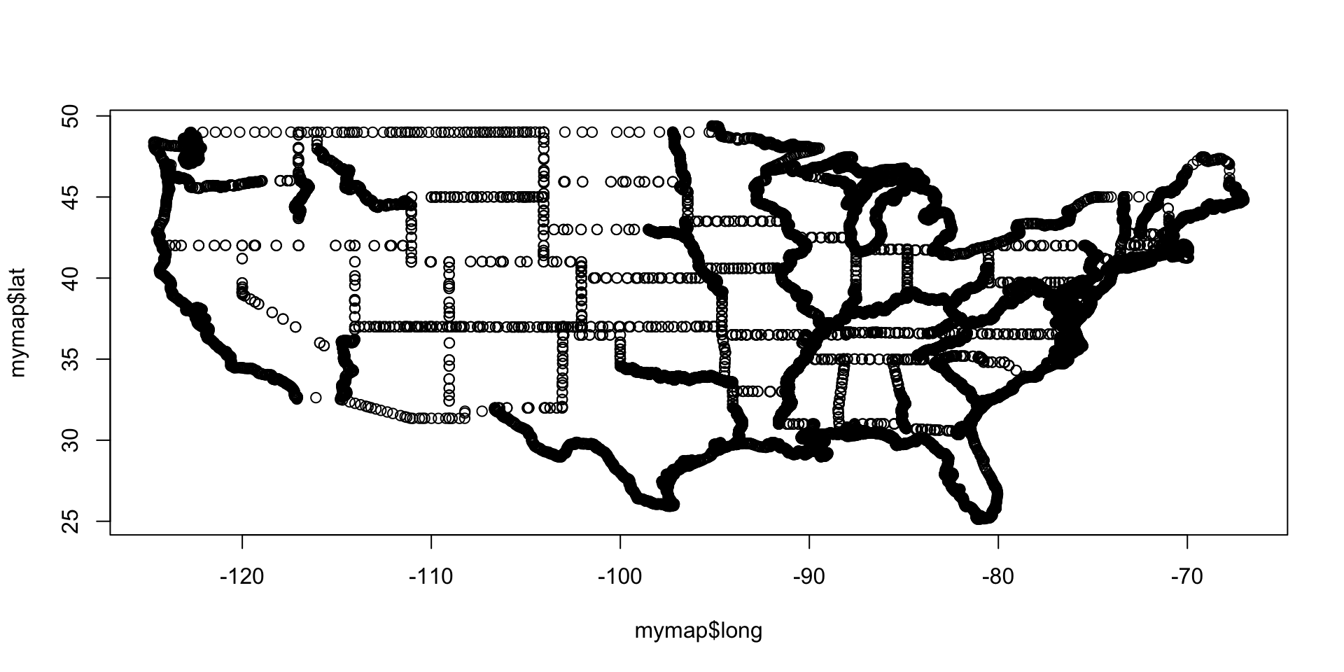
Integration with ggplot
- The pipe operator works very well with ggplot syntax
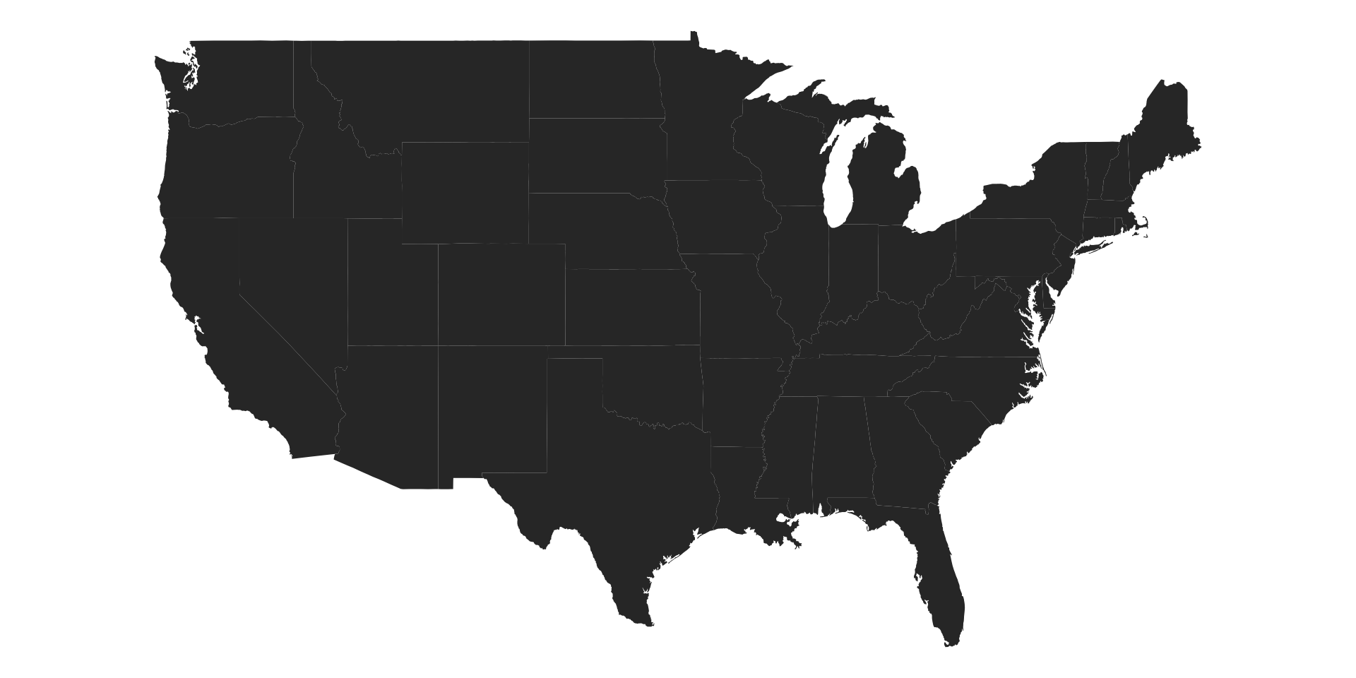
Visualization!